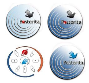
Posterita Logo
Logo Proposition
These logos has been proposed by Jerome Cader based on our very first meeting.
Logo Description
No logo has been finalised yet, we intend to make this a group effort where everyone can contribute their 2 cents on what posterita, should be like. Some say it should have a futuristic font, with a seed representing growth.
As from now, this is what seems to gather general consensus lately.
After debating between Posterita and POSterita. We have settled for none of them.
POSterita was great because of the emphasis on the POS however aesthetically speaking it was unbalanced. Posterita was neater but lack the emphasis on the POS.
The winner is:
posterita.
What we'll do is have the pos with a different colour.
At this time it is still unclear whether there will be only 2 colours or more.
red1 suggested to have pos(in grey silver) and terita(in black)
Keep it simple stupid!
Since one of the main objective of posterita is also to keep things simple. That kinda have it's appeal.
One last thing to add in the logo, is probably something that will remind Mauritius. It was started in Mauritius. However posterita is probably at the beginning of its journey and will make its way towards new and unvisited country.
So we thought about a bird. The dodo doesn't fly and is extinct, something that will surely not remain in posterity. So we thought of this unusual bird, that visits Mauritius.
The paille en queue also known asPhaeton lepturus.
Integrating the paille en queue, seems a nice idea.
We hope that other countries will welcome and adopt our migrating bird.


