Difference between revisions of "Apanel Update Proposal"
From ADempiere
This Wiki is read-only for reference purposes to avoid broken links.
m (Created page with '= '''Apanel Update Proposal''' = In my opinion actual Apanel is very confusing for regular ERP user, because: 1- Many bottoms not usefully for Apanel regular use ( it can locat…') |
m (Add another sugestion Apanel) |
||
| Line 15: | Line 15: | ||
[[File:P1.jpg]] | [[File:P1.jpg]] | ||
| + | |||
| + | |||
| + | ''' Proposed NEW PANEL AD Panel Option B ''' | ||
| + | *New, Save and Delete Icons are located in Universal mode , add record count on top | ||
| + | |||
| + | [[File:P1a.jpg]] | ||
---- | ---- | ||
Latest revision as of 21:22, 2 February 2011
Apanel Update Proposal
In my opinion actual Apanel is very confusing for regular ERP user, because:
1- Many bottoms not usefully for Apanel regular use ( it can located in the text panel) like for example: Product info, Exit, Home, Archive file, Help, tab up tab down).
2- VCR Icons are not ERP standards, (actually is an Compiere style but, Compiere change it in the Professional.
Actual Apanel
Proposed NEW PANEL AD Panel
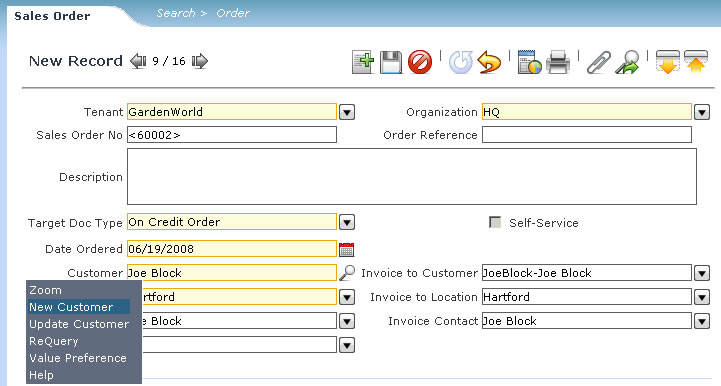
Proposed NEW PANEL AD Panel Option B
- New, Save and Delete Icons are located in Universal mode , add record count on top
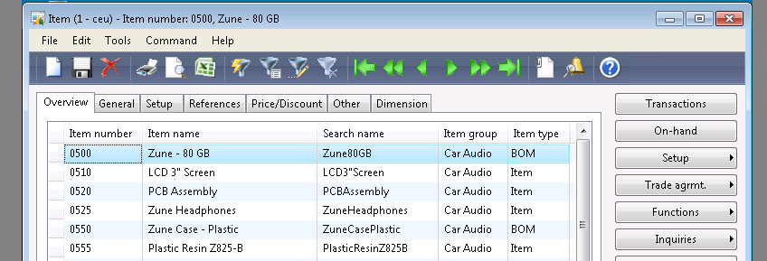
Just for reference check some Apanels from others ERP :
OpenBravo Panel
Compiere Pro Panel
Microsoft AX
Pls let me know comments and suggestions.
Agree
- I agree with your DashBoard and top panel suggestions. You can propose that in Feature tracker wih your patch.
- Also your 'guadar seleccion' i read it before, it is good. Have you contributed it as a patch? - Redhuan D. Oon 22:12, 30 January 2011 (UTC)
- Thanks Boris for this proposal. I think ADempiere could need a facelifting and I would support a development in this direction. Mario Calderon 15:15, 31 January 2011 (UTC)


